
On-demand Mentorship Platform For Higher Education

Applying to top universities for an MBA course can be tough work. Menduca provides an on-demand mentorship platform that connects applicants who want to enrol in top MBA courses with mentors who have already graduated from top schools. I designed both the user and admin sides of the platform. As a product designer, I worked with two developers and two PMs. Due to the coronavirus, the release has been postponed.
Roll and Duration
Team
1 Designer, 2 Developers, 2 PMs, and 1 Operating/Marketing Manager
Responsible
Discussing functions with PM/Dev to refine the requirements
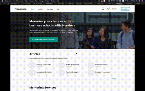
Creating UIs for users and admin
Duration
Jan 2020 – Mar 2020
Problem and Solution
Problem
When I joined the team, the service had already been launched and had gained a few users, but all operations were done manually by the CEO and the Operating Manager. To keep the business running, they needed to streamline their operational time so that they could focus on higher priority tasks, such as acquiring new applicants and fundraising.
In addition, although the service was presented as a 'platform', there was no feature for mentors and applicants to communicate with each other; they had to contact each other privately via email. In order to connect the two more efficiently and easily, the platform needed to introduce a new system.
Solution
We decided to develop a platform that would connect mentors with applicants and allow them to communicate with each other on the system. At the same time, we planned to develop a back-office administration interface to reduce operational costs and time.
Process
Discussing the UX and functions meet the requirements on the whiteboard with PM and designer, and applying it to the low-fi prototyping. After that, we check the consistency in UX, then move to high-fi prototyping.
Difficulties in Design
Complex interaction
Thinking of the interaction between the front page and the back office page was really complicated so I needed to sort out the requirements that make sense in every pattern of UX between the front and back office page by the prototyping.
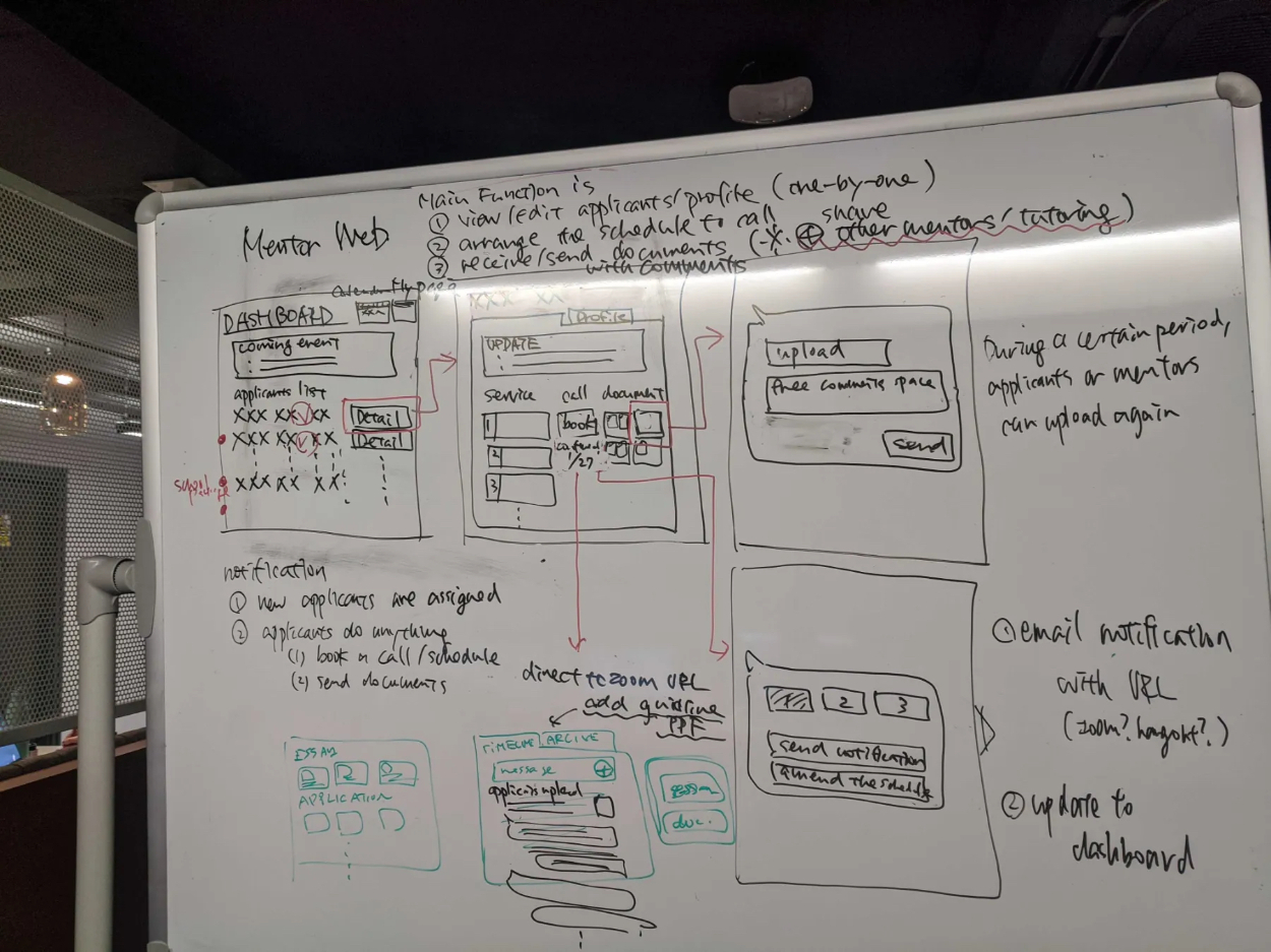
For example, in the matching process of the mentor and the applicant, there were several types of status for both the user side and admin side, so I needed to think of quite a lot of patterns of UX and UIs to test.
Solution1: close communication
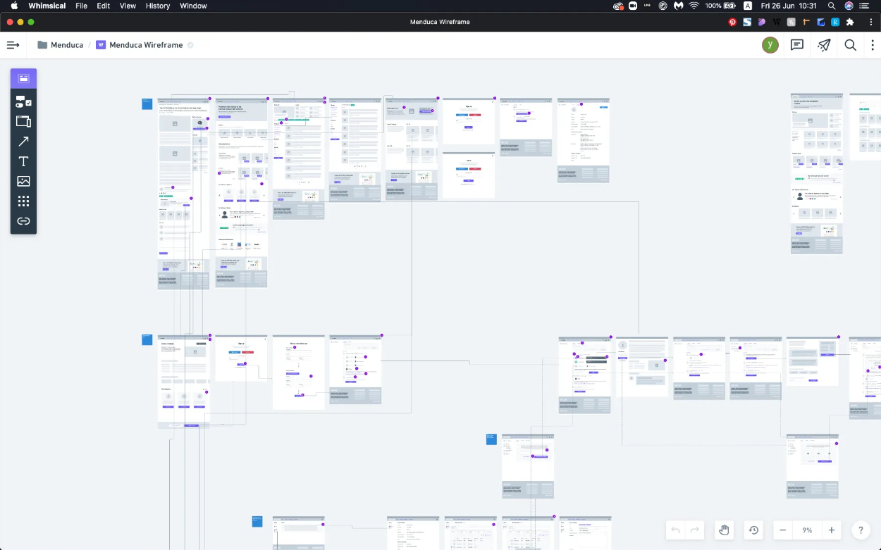
I managed to solve this complex problem by doing weekly prototype checks with my team members using Whimsical+InVison and Figma. These dynamic prototypes allowed the team members to intuitively understand the concept of the interaction and to quickly spot any missing status or awkward interactions.
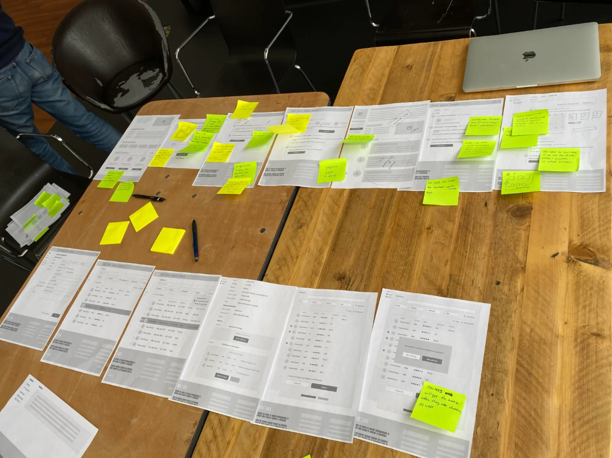
Solution 2: visualise and discuss in the real space
The prototypes for each of the front and admin services were solved through close communication, but we needed to make sure that these complex connections at each stage were appropriate.
So we printed the UIs created on the digital space on paper, laid it out on a table and checked that the front and the admin interactions were appropriate based on the user flow.
Elaboration of the brand
Once the interactions were confirmed, I moved on to creating the hi-fi prototype.
Here I focused on refining the branding. The old version had a lot of colourful, rounded elements and a very friendly feel to it. However, we needed to make it more credible and emphasise the professional side so in creating the hi-fi prototype, I focused on reducing the number of colours and creating organised UIs.
Takeaways
The speed of decision-making has been raised by working closely with the PM.
Choosing the right tool for each phase of development is important in terms of saving time.
Used the new tool (https://whimsical.com/) to create the wireframes, and I found that it was really useful, especially when you would like to testify complex interactions quickly.
The low-Fi prototype works well.
If there are more than 1 sequential interaction, the paper could be one of the solutions.